Landing Pages That Convert — A CRO Checklist for Small Business
Most small businesses pay for the click and then waste it. The ad does its job, someone taps, and they land on a homepage with a menu, six services and a contact form at the bottom. A landing page fixes that. It's one page with one job: turn that visitor into a lead. This checklist covers the conversion rate optimization best practices that matter most on a landing page, in the order we work through them when we build one as part of our web design work.
If you're new to the idea, start with what conversion rate optimization is and why it beats buying more traffic. This post is the hands-on version: twelve checks you can run against any page you're sending traffic to.
Landing Page vs Homepage — What's the Difference?
Your homepage has to serve everyone: new visitors, returning customers, job applicants, people looking for your hours. That's why it has a menu and a bit of everything. Our guide on what a small-business website needs to convert covers how to build that kind of page well.
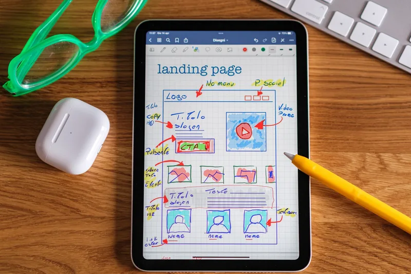
A landing page is different. It's built for one audience arriving from one place, usually an ad or an email, with one action you want them to take. No menu, no tour of your services, no blog feed. Everything on the page either moves the visitor toward that action or gets cut.
Above the Fold: The First Five Seconds
Most visitors decide whether to stay before they scroll. These four checks cover that first screen.
1. The page matches the ad. If the ad says "Free roof inspection in Riverside," the headline says the same thing. Not your company slogan, not a generic welcome. When the page doesn't match the promise that got the click, people assume they're in the wrong place and leave. Google measures this too. Its landing page experience rating estimates how relevant and useful your page will be to people who click your ad, and it feeds the Quality Score that affects what you pay. That's why good PPC management always covers the page, not just the ads.
2. The headline says what you get. What it is, who it's for, and where, if you're local. "Same-week AC repair in Orange County" beats "Comfort You Can Count On." Put the supporting detail in one short line underneath.
3. There's one call to action. Book a call, get a quote, claim the offer. Pick one, put the button on the first screen, and repeat it lower down. Two competing buttons split attention and lower the odds of either getting clicked.
4. The image shows the real thing. Your team, your work, your space, or the result the customer gets. Generic stock of people shaking hands tells the visitor nothing about you.
The Offer and the Form
5. The offer is specific. "Contact us" isn't an offer. "Get a fixed-price quote within 24 hours" is. So is a free estimate, a first-visit discount, or a checklist they actually want. If you need ideas, our guide to lead magnet ideas covers the offers that work best for small businesses.
6. The form asks only what you need. Name, phone or email, and one qualifying question is usually enough. Every extra field is a reason to quit halfway. Get the rest on the call.
7. You say what happens next. One line under the button: "We'll call you within one business day to schedule." People hesitate when they don't know what they're signing up for. Then make sure it actually happens. A fast follow-up by text or email, set up through email and CRM automation, keeps the lead warm while you're on a job.

Proof and Objections
8. Proof sits next to the ask. Put your best review, your star rating, or a real before-and-after right beside the form. Not on a separate testimonials page nobody visits. The moment before someone fills out a form is the moment they're wondering whether you're any good.
9. The page answers the obvious objections. Price range, service area, how long it takes, what if they're not happy. A short FAQ near the bottom handles the questions that would otherwise stop someone from reaching out.
10. The exits are gone. No full menu, no links to your blog or social profiles, no pop-up for a different offer. Keep the logo and a click-to-call number if people phone you. Everything else is a way off the page.

Mobile and Speed
11. It works with a thumb. Open the page on your own phone. Can you read the headline without zooming? Is the button big enough to tap? Does the phone number dial when you tap it? Most ad traffic is mobile, so this is the version that matters.
12. It loads fast. A slow page loses people you already paid for. Compress images, cut tracking scripts you don't use, and test the page on mobile. Our guide to website speed optimization walks through the fixes in order.
Measure, Then Change One Thing
A checklist gets the page to good. Measuring gets it to better. Track form submissions and phone taps as conversions, so you know how many visitors become leads and which ads sent them. That setup is the first thing our marketing analytics work handles, because nothing else in this post can be judged without it.
Then change one thing at a time. A new headline this month, a shorter form next month. Give each change a few weeks and compare it against your baseline. At small-business traffic levels, a formal split test can take months to reach a reliable answer. Making one clear change and watching the trend is the practical version.

Where to Start
If you're running ads to your homepage right now, that's the first fix. Build one landing page for your best-performing ad, run it through checks 1 to 6, and send that ad's traffic there. Then work through the rest as you go.
If you'd rather hand it off, we build landing pages and the paid ads that feed them, so the promise and the page match from the first click. The work we've done shows what that looks like in practice.
Frequently Asked Questions
Paying for clicks that don't turn into leads?
Book a free 30-minute call. We'll look at the page your ads send people to, run it against this checklist, and tell you the first three things to fix.
Book a Free Landing Page Review